The Vehicle settings project
Internship at MyCamper 2026.
This project was carried out during my internship at MyCamper, a platform for renting motorhomes and campervans. The task was to redesign the editing pages for vehicle owners, making it easier to find and edit their listing information.
The work was done together with a classmate during our shared internship period. We each sketched separately at first, presented our proposals to each other, and jointly decided which ideas to develop further. Parts of the design work were divided screen by screen, while the design decisions were made together.
The aim was to improve the experience for vehicle owners, whether they rent out one vehicle or several. The central question was how restructuring the pages could make it easier for owners to find and edit their listing information.
Design process
The work began with a research phase where we wanted to understand both the industry and the users. We carried out a competitor analysis, a design audit of MyCamper's existing pages, and interviews with vehicle owners and customer service. The insights were gathered in an affinity diagram, which helped us spot patterns and prioritize what was most important to solve.
Based on the research, we mapped the existing structure in a sitemap and then developed a new, hub-based structure that formed the foundation for the design work. We started with paper sketches to explore ideas quickly, moved on to wireframes in Figma focusing on information architecture and flows, and iterated continuously through design critique. Once the structure felt well thought through, we moved to high fidelity, working mobile-first and considering accessibility through contrast, text sizes, tap targets, and cognitive load.
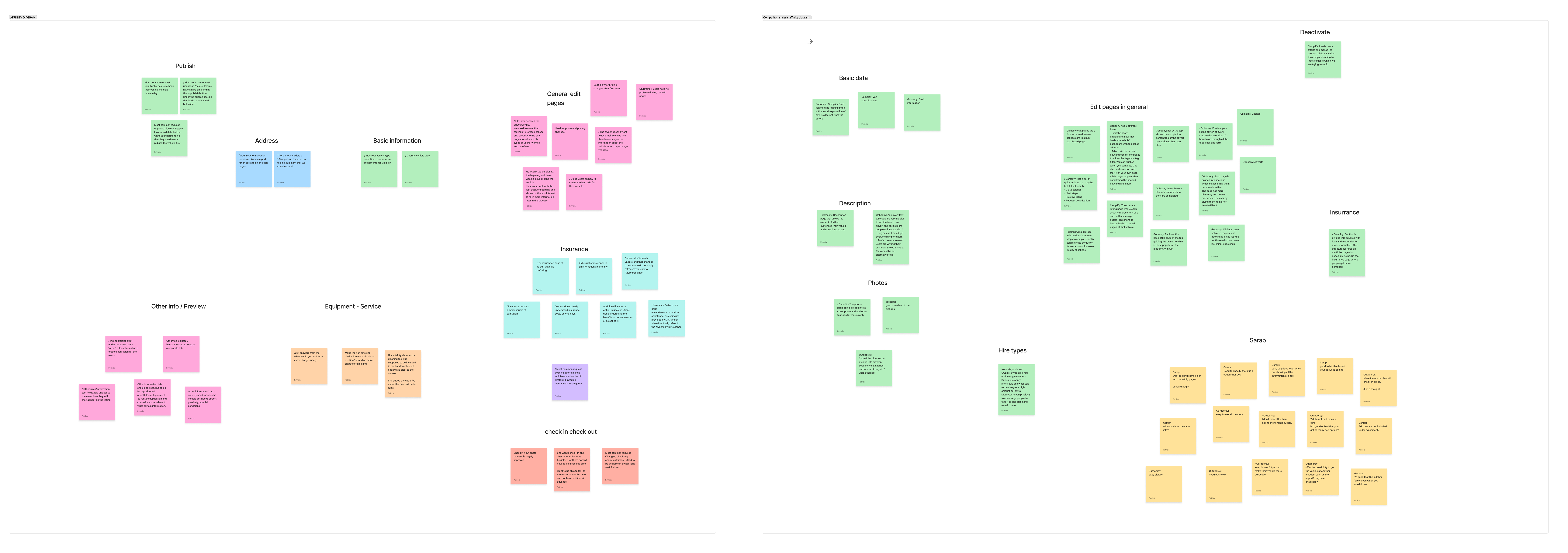

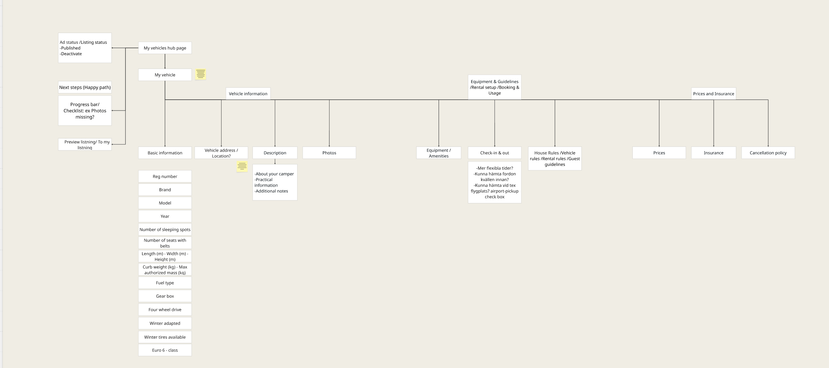
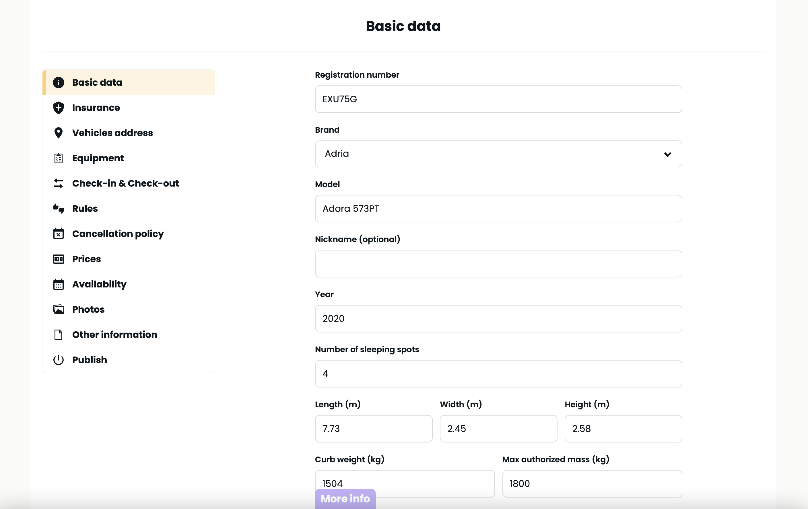
From the existing structure to the new, hub-based sitemap.
Results
Structural change
The biggest change was moving from a linear flow to a hub-based structure. In the existing solution, all editing options sat in one long, ungrouped list, which made it hard to get an overview. Instead, we divided the content into four logical sections, where related information is gathered and the page becomes easier to scan and navigate.
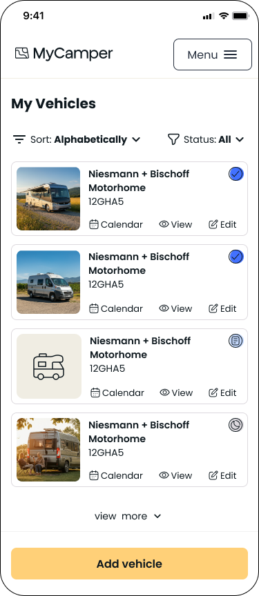
Vehicle overview
The solution starts with a vehicle overview that gathers all of an owner's vehicles in one place, something that was missing entirely before. We chose to show it to all owners, even those with a single vehicle, since a consistent interface matters more than the extra click it adds. For owners with more than four vehicles, sorting, status filtering, and a "view more" option appear, so the list stays easy to overview even as it grows.
Vehicle settings
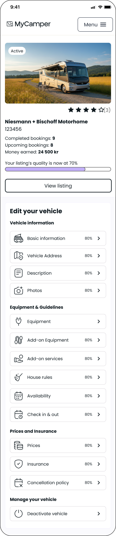
The central page is a hub where the owner manages all information about their vehicle. Since the previous linear flow doesn't work well for editing – owners need to jump straight to what they want to change – we built the page as a hub with a clear overview. Progress indicators show how complete the listing is and what's missing.
Subpages
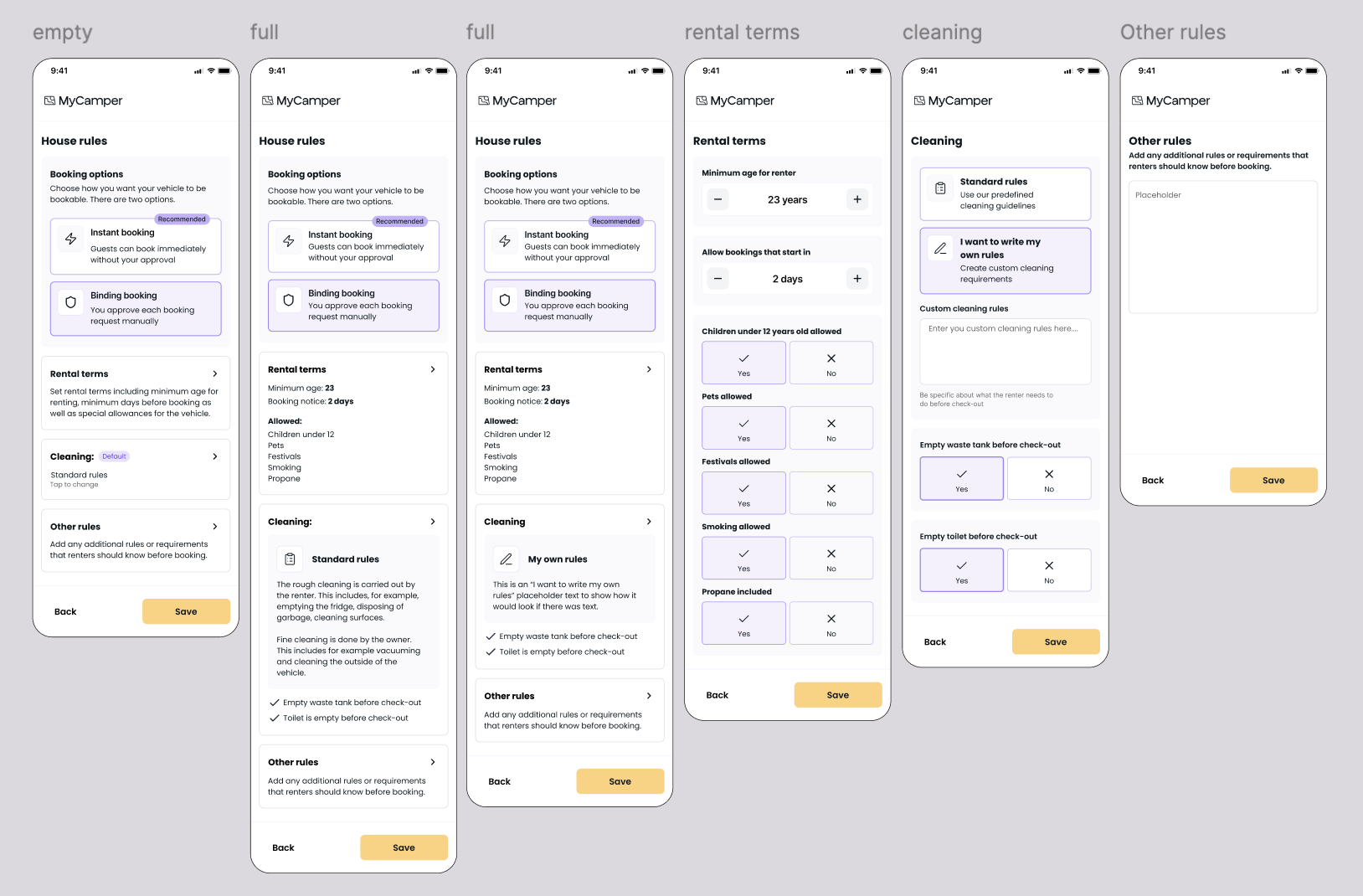
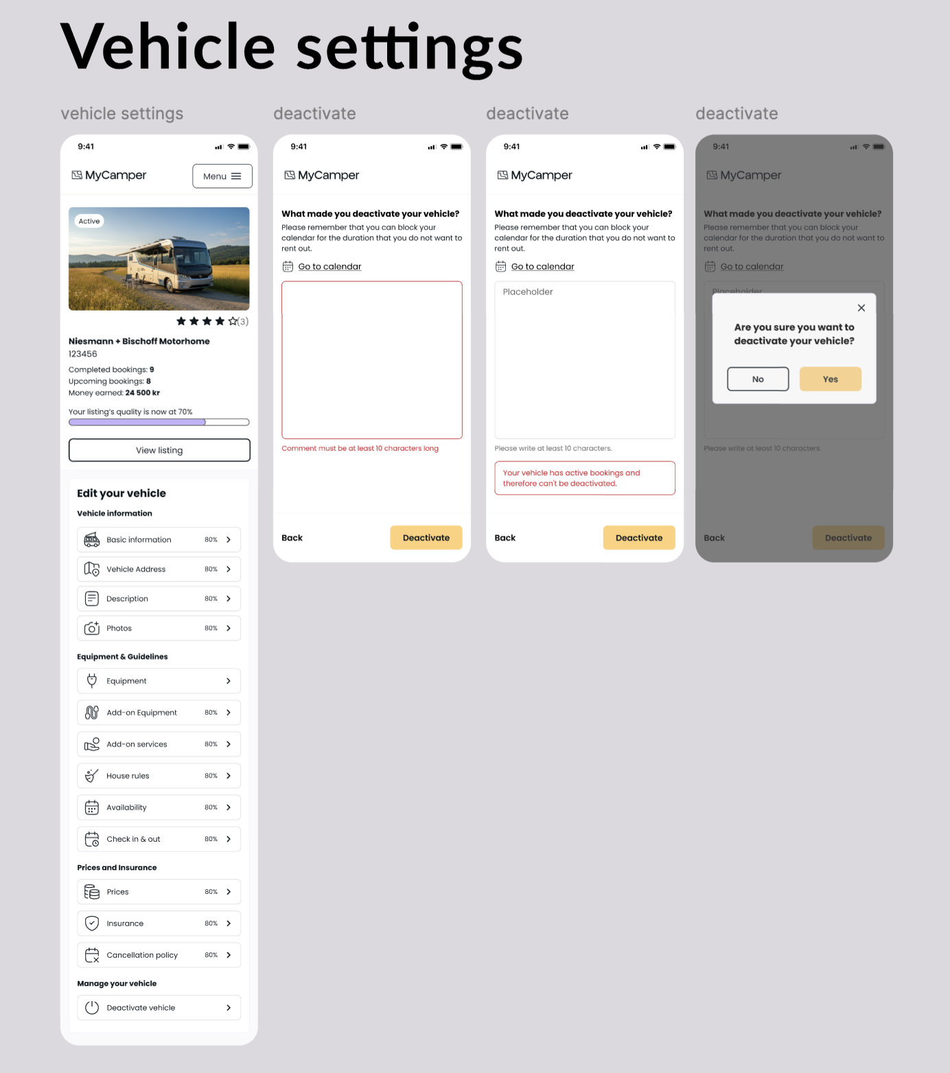
Within the sections, we made several smaller but meaningful changes. Radio buttons were replaced in several places with icon cards, which are clearer and have larger tap targets, and add-on equipment and services were broken out into their own sections to make them easier to find. The deactivation function was made more accessible but deliberately understated, with a flow that counteracts hasty decisions: it first suggests blocking dates in the calendar, requires a reason, and is stopped if the vehicle has active bookings.
Reflection and learnings
One of the clearest lessons was to seek feedback more actively. During a period when our supervisor was away, we waited instead of turning to the product manager and other designers – and earlier feedback could have caught things we needed to adjust later. I've taken away that it's better to ask one time too many than to wait.
Perhaps the most important insight was learning to balance my own ideas against what the product actually needs. At times we had to make design decisions we didn't always agree with, but that were right given the product's and the company's priorities. It gave me a more realistic picture of what it means to work as a UX designer in a real product environment.