Varukorgen
This was an individual assignment in the UI Design course at Nackademin. The task was to design an app for express grocery delivery within 10 minutes, aimed at city dwellers with spontaneous needs – like dinner ingredients, breakfast cravings, or emergency items like toilet paper.
I started from user needs and wireframes developed by a user researcher. Based on that, I created a high-fidelity UI design that felt clear, intuitive, and visually consistent. The goal was to design an interface that makes it easy to quickly find what you need and get it delivered with minimal effort. It was an intense but fun project where I got to apply core UI principles in practice.
Design Process
My design focused on creating a simple, fast, and clear user experience. I worked with the scenario “The spontaneous movie night” and designed three mobile views and one iPad view.
Home screen (mobile)
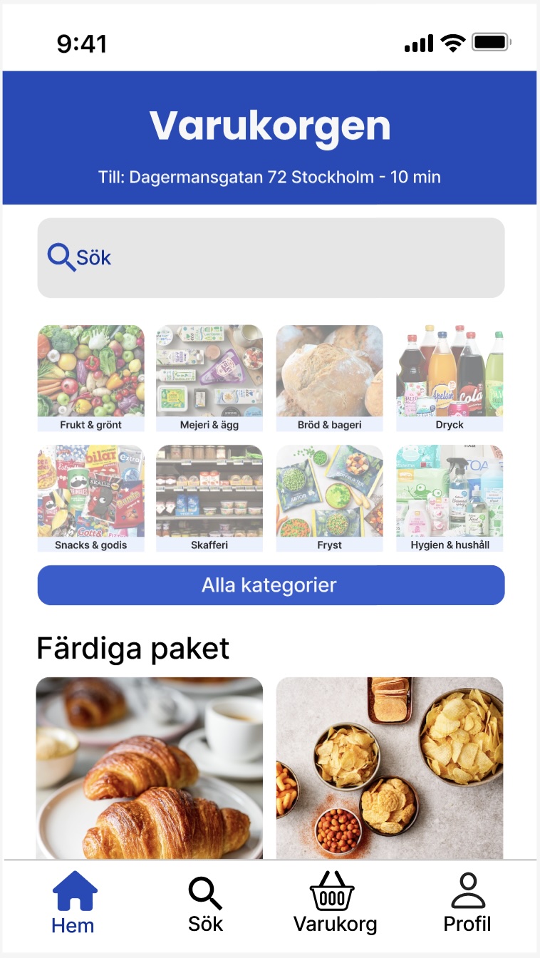
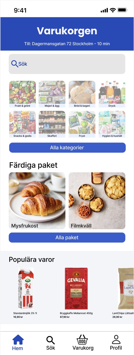
A quick overview with a search bar, category cards, ready-made bundles like “Movie night” and “Weekend breakfast,” and a section with popular items to boost conversions.
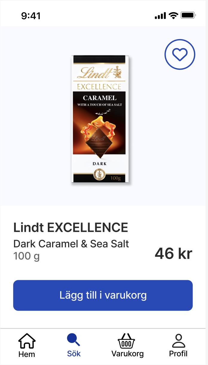
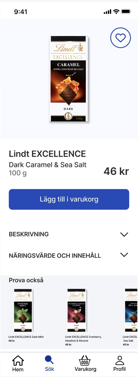
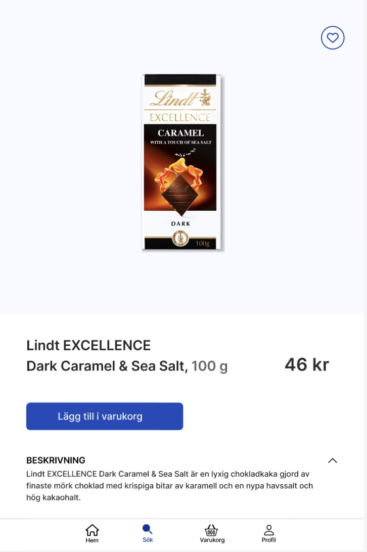
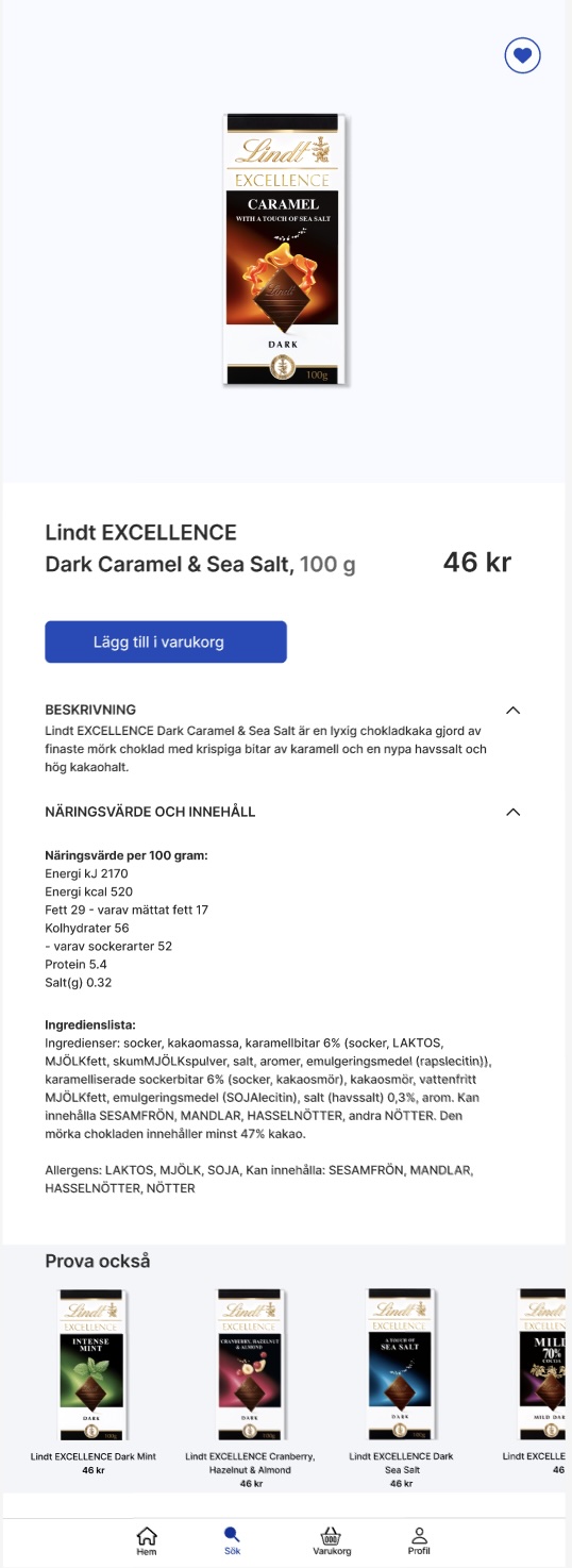
Product view (mobile and iPad)
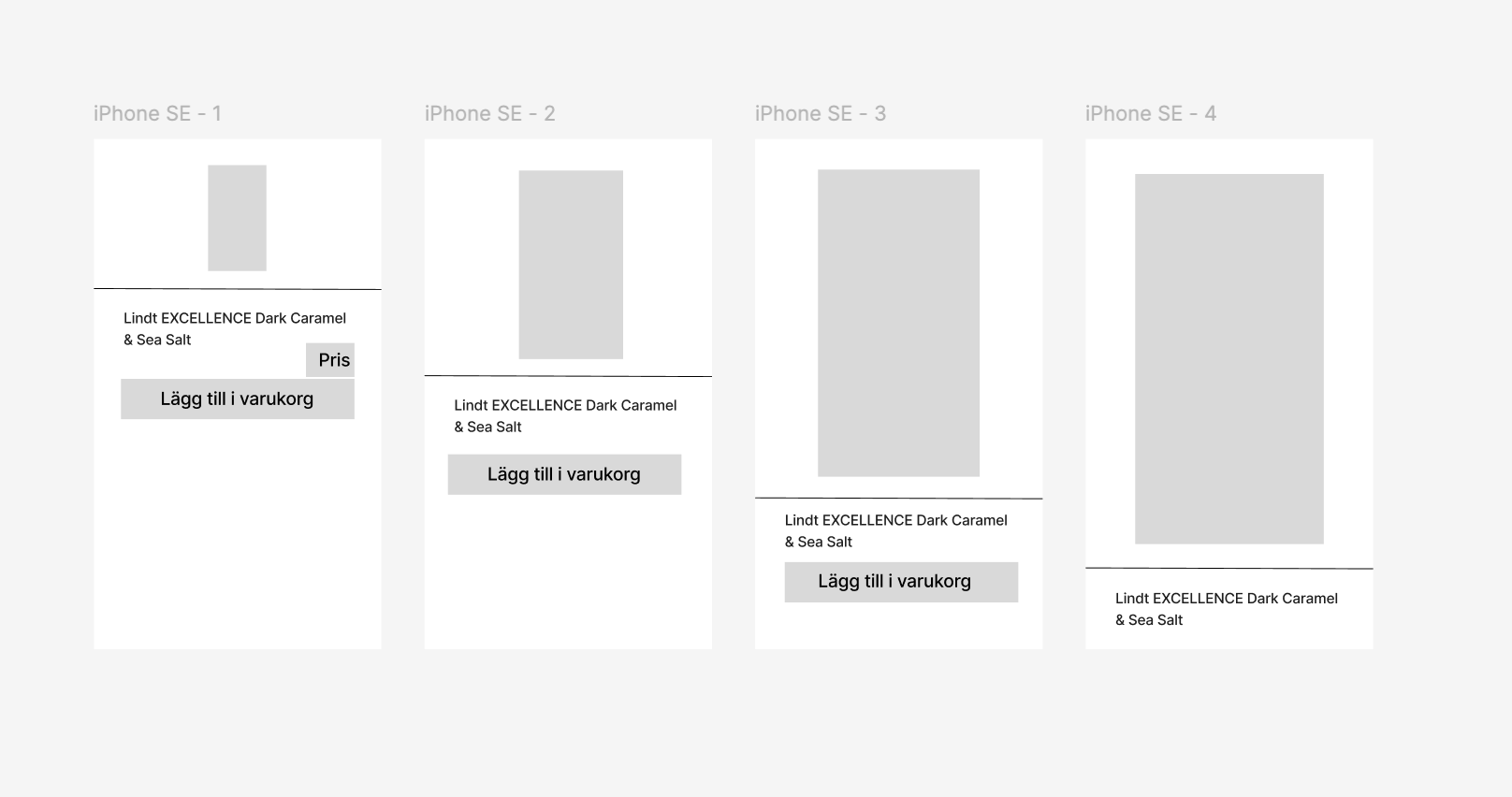
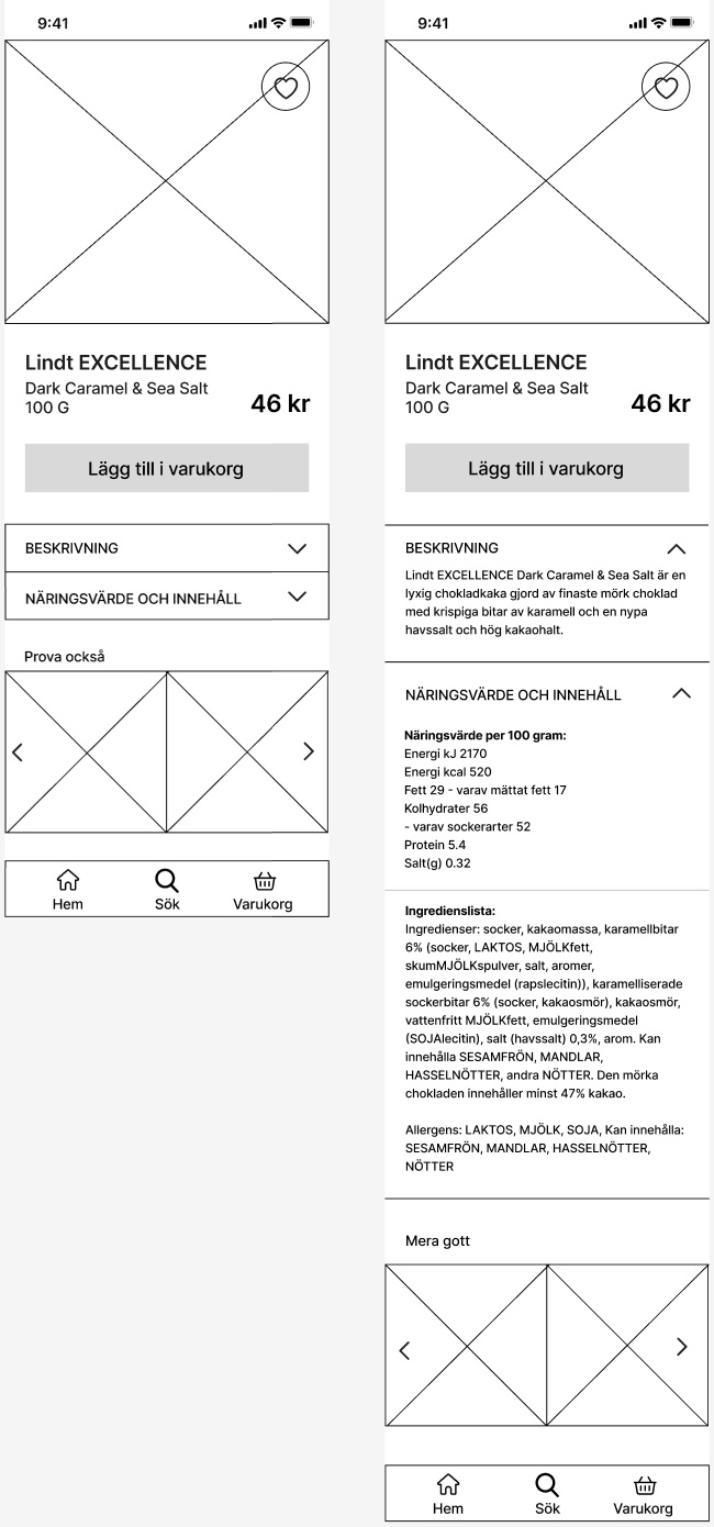
A clear layout where image, name, price, and the CTA button are in focus. Expandable sections provide more info like descriptions and similar products. On iPad, I adjusted typography and spacing for a more spacious look.
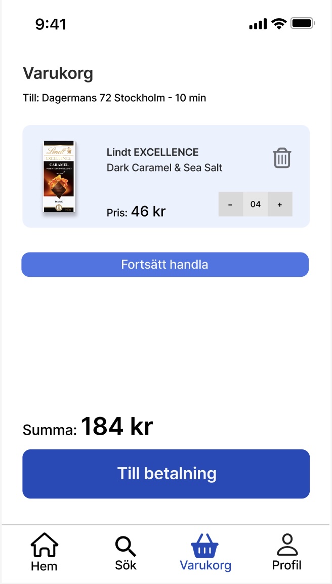
Shopping cart (mobile)
A simple and clear overview of selected items, with the ability to adjust quantity directly. Price and total are clearly presented, and navigation back to the store or to checkout is easy and visually guided.
Visual choices
I chose blue as the primary color to convey trust, clarity, and speed. The typeface Inter ensured good readability across screen sizes. Visual hierarchy was reinforced with contrast, spacing, and typography.
Reflections and learnings
This project gave me the opportunity to practice making design decisions based on both user needs and business goals, while also applying UI principles in a practical context. One key takeaway was how typography and spacing need to be adapted for different screen sizes to ensure a consistent and clear experience. I also realized how color and typography affect visual hierarchy and help guide the user’s attention.
If I were to redo the project, I would plan the process more clearly from the start, prioritize better between views and details – and dare to start earlier, even without having everything figured out. This project boosted my confidence in Figma and gave me valuable insights for future UI work.
